Evolution of a logo – Milwaukee Protocol
Knowing a client’s background and particular tastes can go long way with achieving positive results.
A lot can be said about maintaining long-lasting relationships with clients. I have had to opportunity to be working with a handful of mine for over 15 years. Lucky for me, moving to Sweden didn’t discourage them from hiring me with a quick design brief in an email. I am grateful for their continued loyalty. You know who you are.
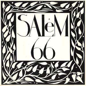
Without too much direction from the client other than artwork from an indie band from the 90’s, I went ahead with several ideas and made every attempt to paint with a wide brush. I didn’t even know what his band sounded like, which really forced me to try and touch every base with the initial drafts.
This was a project where a long-term client/designer relationship really proved to be a valuable silent assistant.
As you can see from the gallery below, I first offered up a wide variety of directions with the hopes of nailing down a path for further refinement. I really liked the first one, honestly. (curly) I thought it was most similar in style and feel to the Salem 66 artwork that I was given as a reference. However, I knew….I knew that the 45 adapter design was gonna be the one that the client really liked. I have known this guy for close to 20 years and I was confident that all the other designs were destined for the dustbin.
Needless to say, my suspicions proved correct and George quickly returned with his desire to move forward with the “genius” 45 adapter direction and I was very happy with that decision. It was then up to me to take it to the next level.
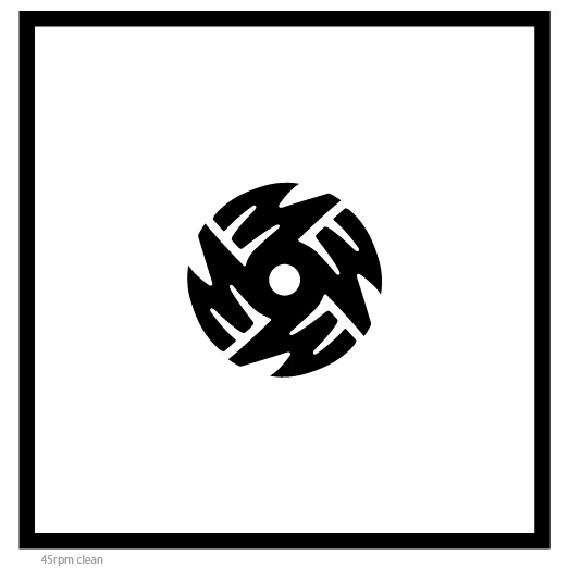 Perhaps as a secondary use of the logo, I love this stripped-down, clean version of the simple circular design on a white field. Definitely reminds me of the spartan logo artwork of bands like Black Flag and the Dead Kennedys. Simple designs and symbols that were as powerful as the movements they represented.

